A particularly contemporary approach to art, fashion, and music is the mash-up. So easy is it to collage, stitch, and appropriate a variety of digital media, that it has given rise to a new aesthetic: what we call the tumblr look.
So, for example, tumblr fashion is a disparate melange; it could be panda bear shoes, baby doll dress, gothic vampire blouse and pink hair – a mash-up of pop, meets Goth, meets baby-doll. This approach started to take hold on tumblr among young fashionistas and is now mainstream.
The point of these collages is not to pastiche or ironically comment in any way. It is totally in earnest. It tries to find unity in diversity, and coherence in the fragmented.
I would say that the new five dollar note, announced yesterday by the Reserve Bank of Australia, is a perfect expression of this aesthetic.
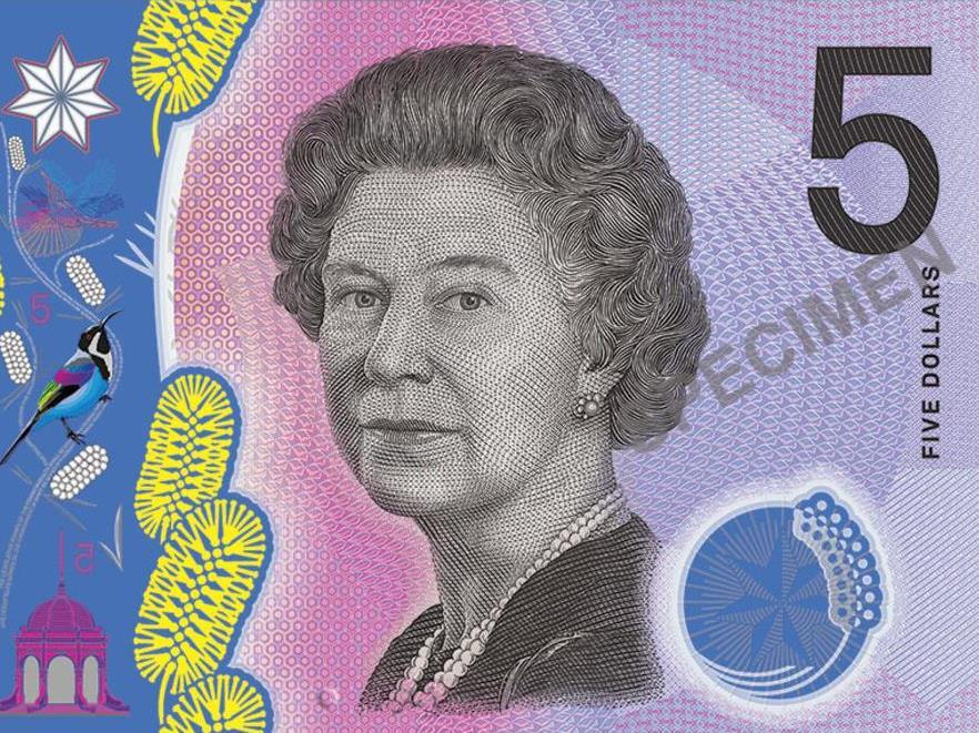
It’s a bold and jarring creation. Stylised wattle, meets high realism (in the image of the bird), meets photographic processes (in the image of Parliament House), meets the old etching style (in the effigy of the Queen), meets tactile elements.

Basic artwork for the serial number side of the new $5 note.
The broken-up nature of the imagery is exacerbated by the central transparency, which splits the horizontal format into three. The colour shift from peach to mauve across the note is punk in its audacit
Compare it to the current five dollar note and you’ll see that the old note, designed by Bruce Stewart, is much more balanced and coherent as a design overall. It’s a unified whole and stretches well over the horizontal format.

Signature side of the current $5 note design.
The boldness of this new note owes a lot, in my mind, to computer-aided design. The way things are placed on top of each other, with different stylistic approaches, reminds me of the excitement we all felt when we first had access to a hundred fonts on our home computer. Every children’s party invitation had at least six different fonts until we realised it was bitsy and inelegant.
The use of the computer is not in itself bad, but the design should be done well and still within the logic of the coin and note form.

Basic artwork for the signature side of the new $5 note.
Even the effigy of the Queen looks as if it has been passed through Photoshop rather than redrawn. It’s a great honour in the numismatic world to author an effigy of the Queen. The fact that her hair and the clothing look the same as on the old note suggests that this is not a new portrait although it looks very different.
Design by committee
A number of critics have mentioned the “design by committee” feel of the new note. This is a very meaningful comment on many levels. Who is the designer? Why hasn’t one been named? The Mint has a long history of great artists, but I’m worried that we don’t trust our designers any more. (As an aside, the Mint’s current designers are paid too little.)
So who is the committee? Even the effigy of the Queen is unauthored, and it all sounds a tad bureaucratic. The Reserve Bank statement reads,
[The note was a] culmination of a process of extensive consultation with subject-matter experts and the cash-handling industry.
Yes, but what about the artists or numismatic connoisseurs, art historians or design experts? The committee that chose the wonderful Stuart Devlin for our coins in 1966, was chaired by Hal Missingham, the Art Gallery of NSW director. Couldn’t someone from the great art school at ANU, for example, have popped up for a visit?
The Australian Mint has much to be proud of in its history of design. But it seems to have thrown out any sense of the design possibility of coins and notes, and the long history of this type of art.
I am quite glad that the note, which brings to mind a rave party at an 80s Coff’s Harbour resort, has started people talking.
It has reminded us that the output of the Mint is designed objects, and they can be critiqued.
This article was originally published on The Conversation. Read the original article.